First, Draw a Line Through the Letters

I thought this article about "The Hindi-fication of a Typeface" was interesting. It's about a type designer in Australia and the font he designed for a museum show about Bollywood. The comments to the post include a couple about "ethnocentrism" and other faux pas. I don't love the typeface (the random capital letters bug me), but it's hard for me to see the harm in it.  I've got soft spot for this and other "Hindi-fied" typefaces, which seem to appear a lot in English-language signs and billboards throughout India. Obviously, they're always used in a jokey fashion, and a little of them goes a long way. The words are usually hard to read.
 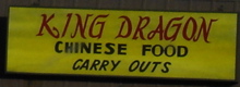 But it isn't just Hindi that gets this treatment. In Bangalore I also saw Chinese-ish typefaces, which mostly appeared on restaurants and on beauty parlors (there are a couple really good examples around St. Mark's Road). Seeing these signs made me homesick for the U.S., since Chinese restaurants here use similar cornball typefaces. (That's where this example came from.)
When I get back to Bangalore in a few days, I'm hoping to find a few examples of English typefaces that have been Kannada-fied or Tamil-fied. I think I've seen some, but nothing specific comes to mind. A little help? And for the grand championship, are there any non-English signs that ape typical English-language typefaces?
P.S. Here are the photos by Jonathan Torgovnik that appeared in the exhibit. They're worth a look.
![]()

No comments:
Post a Comment